


Easing Into Fall, One Well-Placed Accessory at a Time
THE LIFE STYLIST
Some modest, seasonal tweaks to your interior design will work wonders on your perspective.
By David J. Witchell

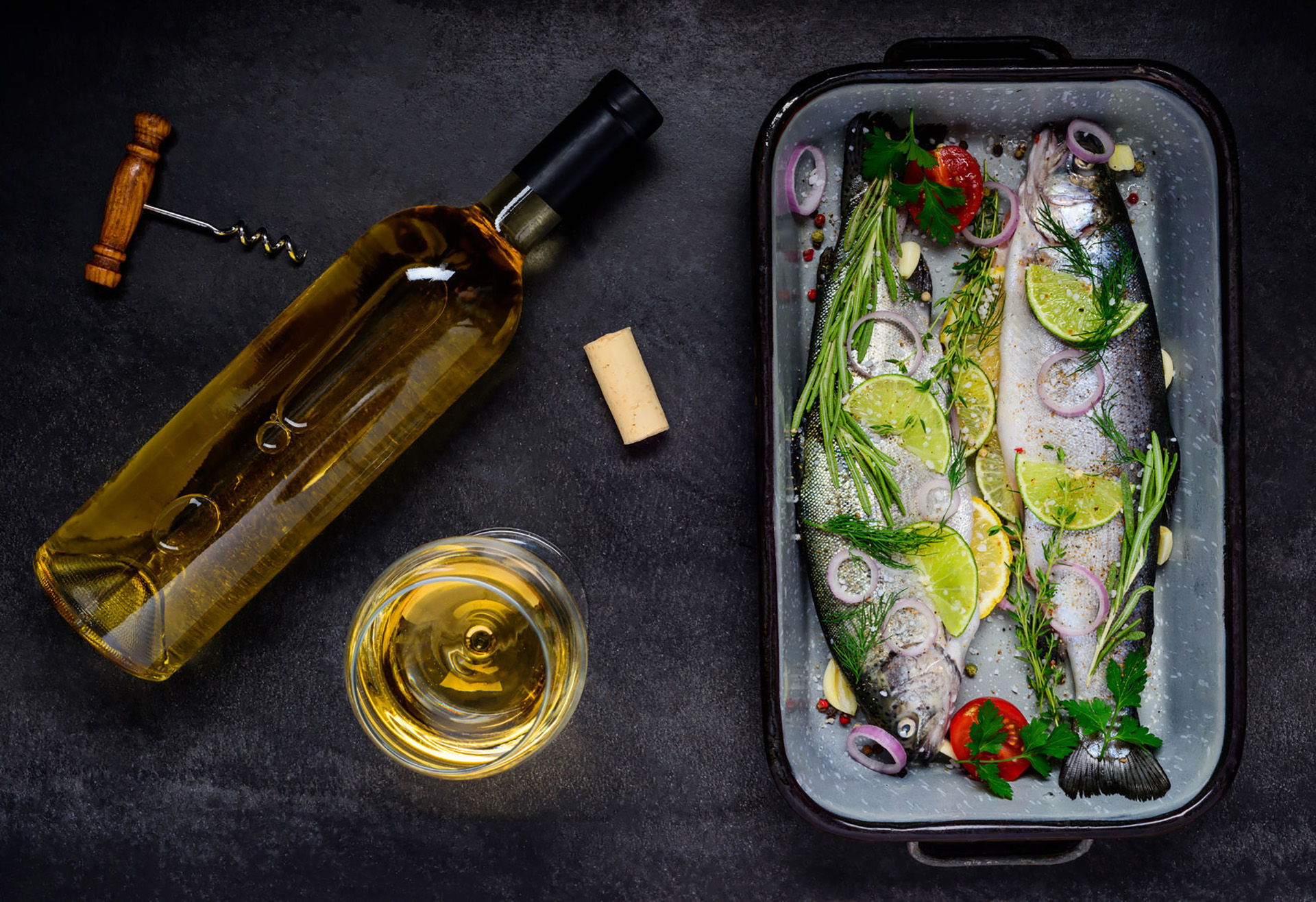
Before you start scattering dead leaves around the house, there are other ways to go about introducing those fall colors.
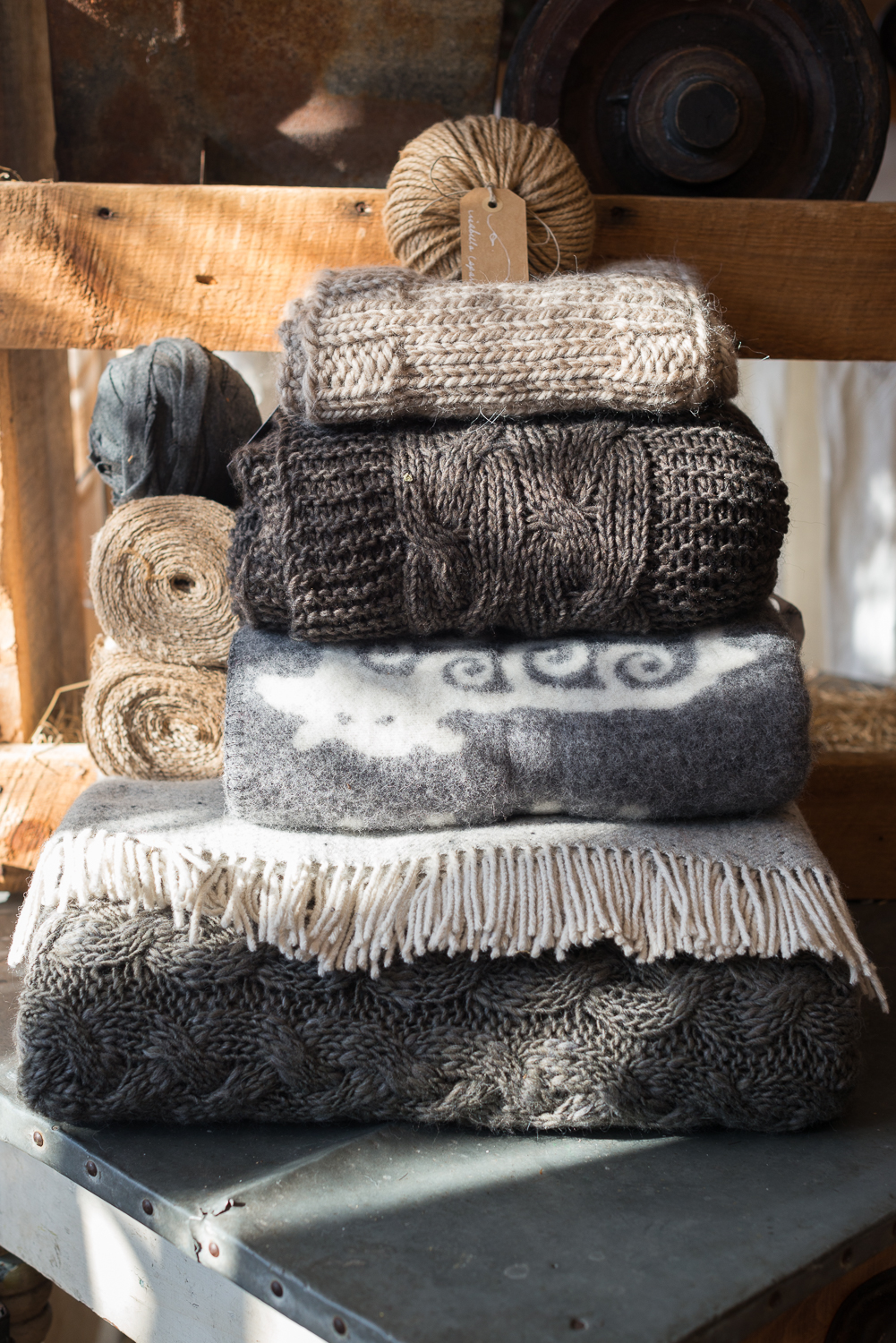
Neutral hues have always formed the base layer around my home. I get bored with colors quickly, and the vanilla canvas allows me to overhaul the accessories from season to season. Honing in on a new part of the spectrum every few months has a way of refreshing all of the fixtures, not to mention my own spirit.
Still, it’s a bittersweet time of year. It’s invigorating to reintroduce fall’s shades, but it’s just as hard stowing away the summer stuff. Turquoise encourages communication and clarity, and indigo is the color of intuition. Blues, in general, tend to facilitate peace and grounded order, which makes them the ideal palette for the year’s most carefree, restorative months.
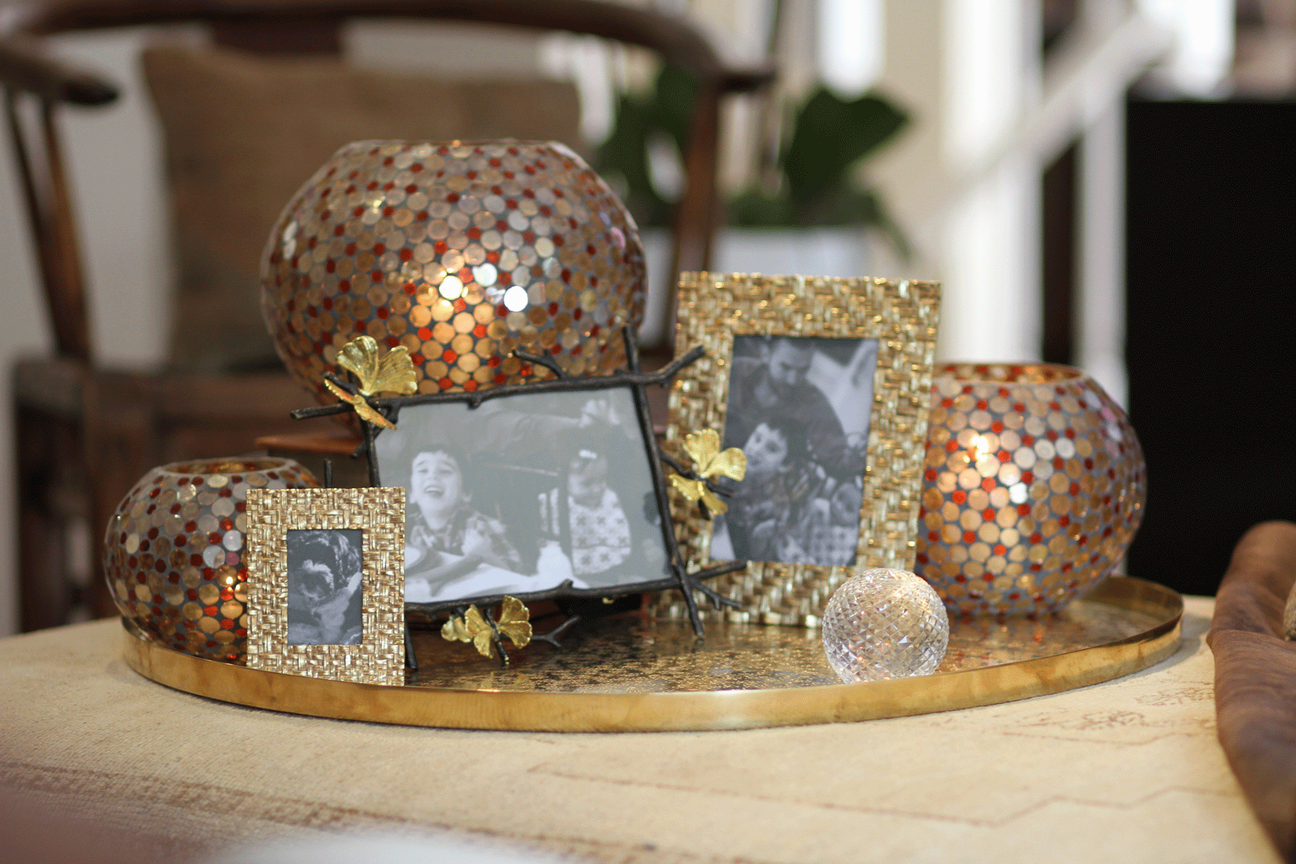
Fall, for me, looks like warm metals and hits of crimson, cayenne, rust and goldenrod. I may be especially partial to the season because orange is my favorite color. I’ve also come to learn that it represents optimism. Blending in reds helps me feel energetic and fuels my ambition and determination, a particularly productive cocktail of qualities. Yellow just makes me smile. I throw in some green or magenta for balance and harmony. And somewhere in my office, visible from my desk, I make sure there’s a splash of purple to spark my creativity.
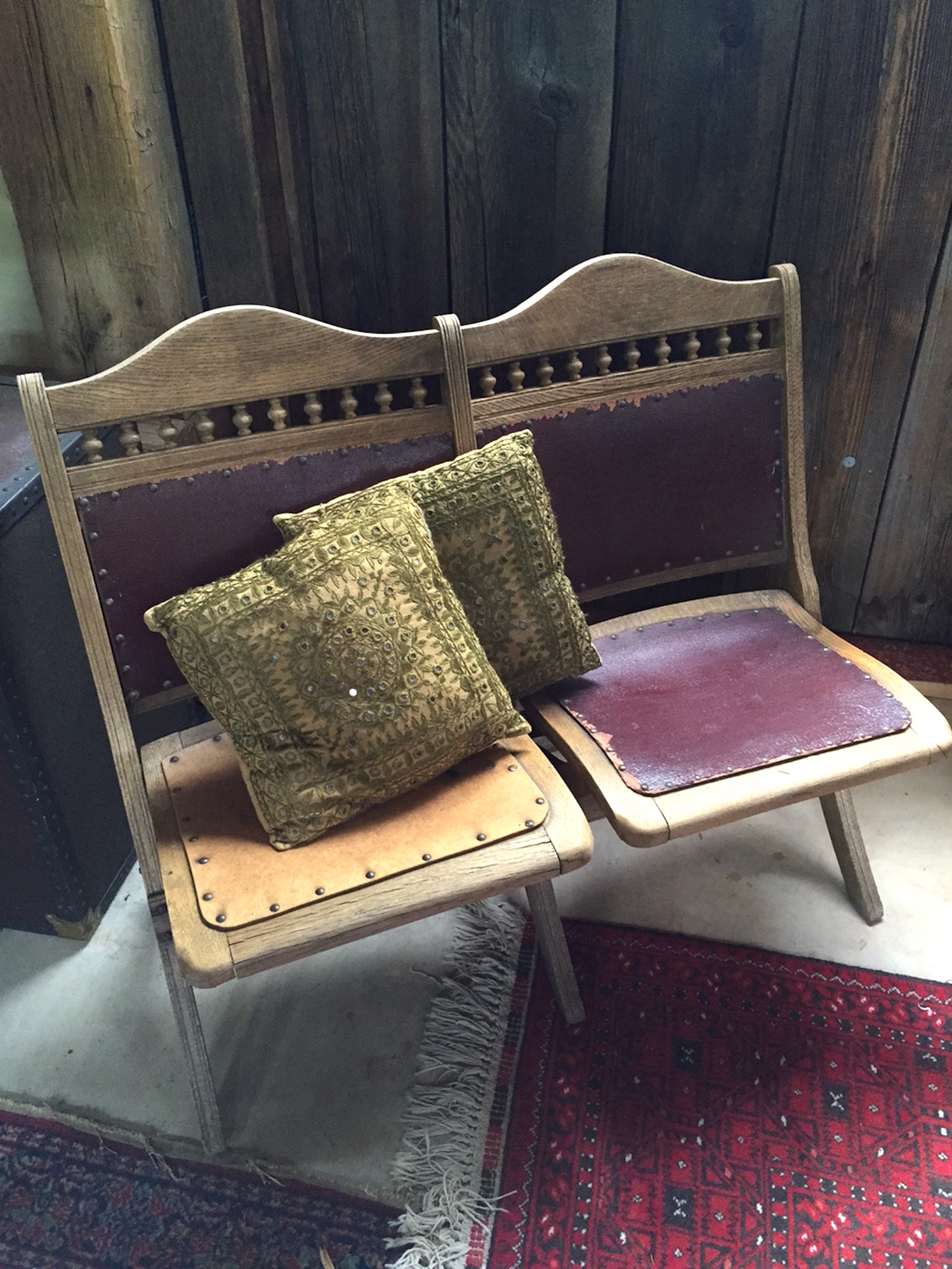
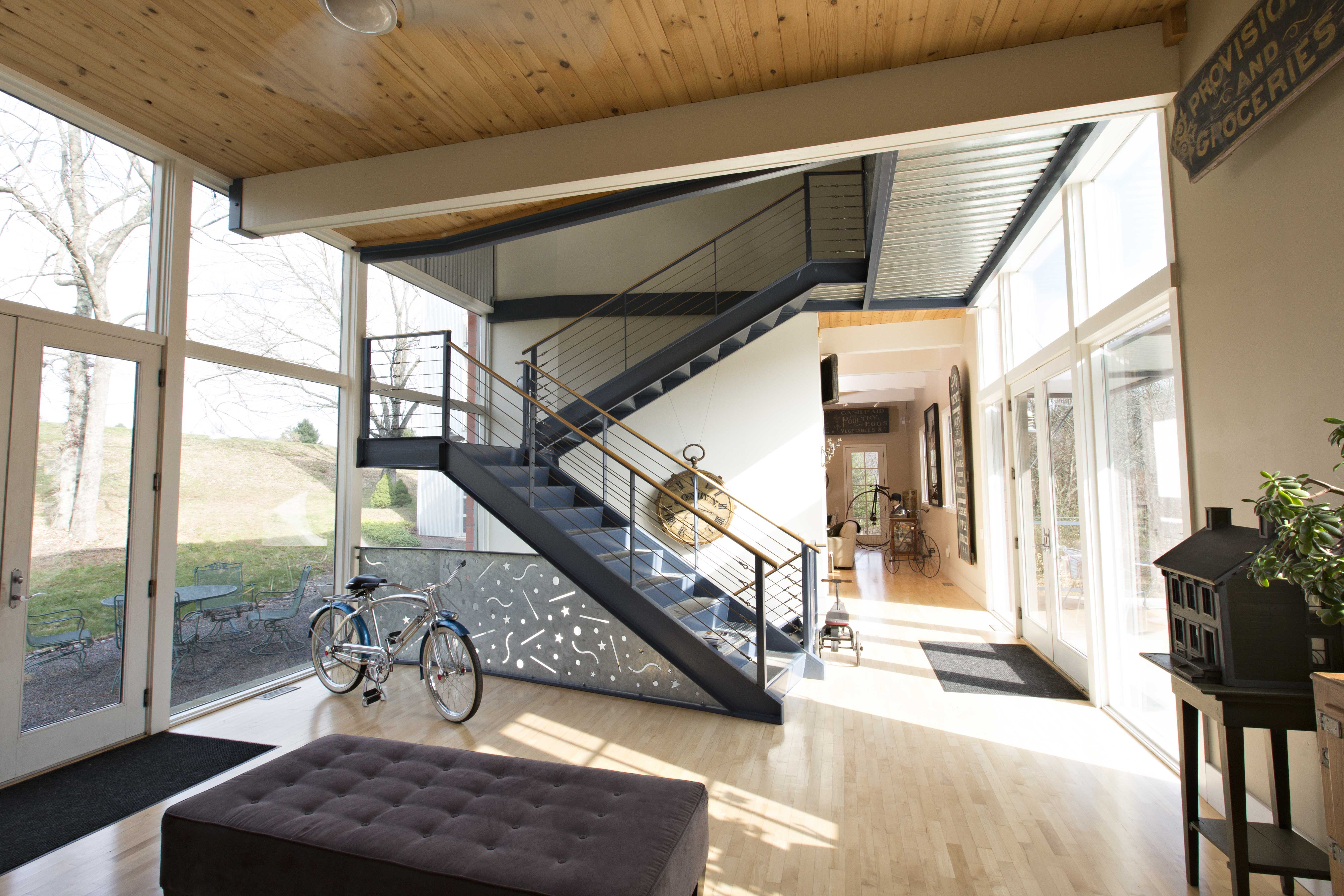
Beneath it all are the browns, grays and whites, the ideal companions for my seasonal whims. It’s easy to look straight past them, but without them, there’d be no anchor, no context. Instead of flowing with the landscape on the other side of the windows, the accents would appear to be at war with the spaces around them. It all works and, just as importantly, it all transitions relatively effortlessly because there’s a consistent, objective platform upon which I can express some personality. Less discretion would back me into corners that I’d be stuck in for years at a time.
And those neutral colors have some personality of their own. Brown embodies warmth and bit of gravity. Gray represents compromise. Little wonder, then, that I’ve used it so liberally. And white connects us to innocence and a sense of fruition.
Interior design is not unlike how we go about dressing ourselves. If I was to go around draped in jewelry, a loud-patterned sweater, putting-green colored khakis and a pair of Christmas-red boots, what would that say about me? I know mixing patterns and colors is having a moment, but with that kind of wild abandon, it all turns into white noise. I love my home. And when I switch out a few well-placed variables, it reminds me why I love it, because those pieces manage to cast it in new light. And that’s all it needs most of the time. To constantly repaint walls and interchange furniture and art would only be masking that appeal.
David J. Witchell is the co-owner of David J. Witchell Salon & Span, in Newtown and Lahaska, and The Boutiques at 25 South, in Newtown.
Photos by David J. Witchell